How to Create a Custom Layout Gallery Slider for Your Website

Custom Layout Gallery Slider
Sometimes a beautiful design can cause some head-scratching for developers. That was the case for the recent development that included this custom gallery carousel block.
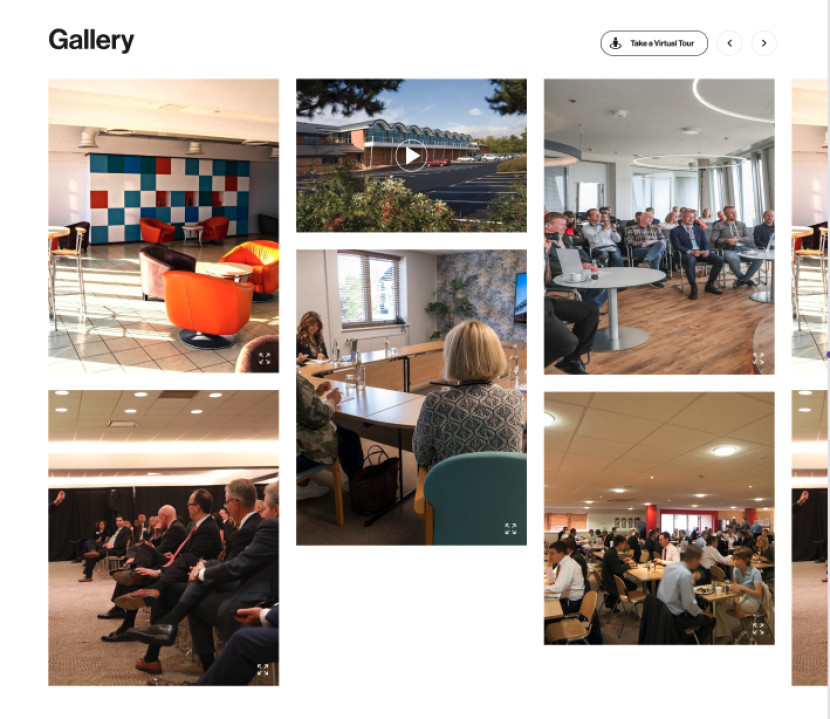
At first glance it's nothing unusual, a classic one row slider on mobile, and a two-row slider layout on desktop, with the ability to add both images and videos via CMS admin panel (plus a modal opening an image or a video in full-size).
When you start to plan out the build in your head, you realise that the task is trickier than it looks. The project is already using the splide.js package for carousels, so ideally this block should also use it. Included in the package documentation Grid Extension looked promising, except the two-row desktop layout had variable height of the elements, therefore could not be a grid.
A bit of a brainstorming and some coding trial and error produced a solution. When the mobile layout is fairly straightforward (1.5 slides per page and custom arrows, all of which are achievable from splide.js options), the desktop layout is a different story. In order for those two not to clash with each other, two separate sliders had to be created.
The 768px breakpoint is when one of the sliders will be destroyed and the other created. Syncing both sliders together is a crucial part of making sure both carousels work.
#gallery-slider.js
import Splide from "@splidejs/splide";

document.addEventListener("DOMContentLoaded", () => {
   let mobileSlider = new Splide(".mobile-slider", {
       ...
       mediaQuery: "min",
       breakpoints: {
           768: {
               destroy: true,
           },
       },
   });

   let desktopSlider = new Splide(".desktop-slider", {
       ...
       breakpoints: {
           768: {
               destroy: true,
           },
       },
    });

   mobileSlider.sync(desktopSlider);

   mobileSlider.mount();
   desktopSlider.mount();
});
Data
As already mentioned, images and videos come from the CMS admin panel. The Gallery Block can be added to any page that uses a Page Builder.
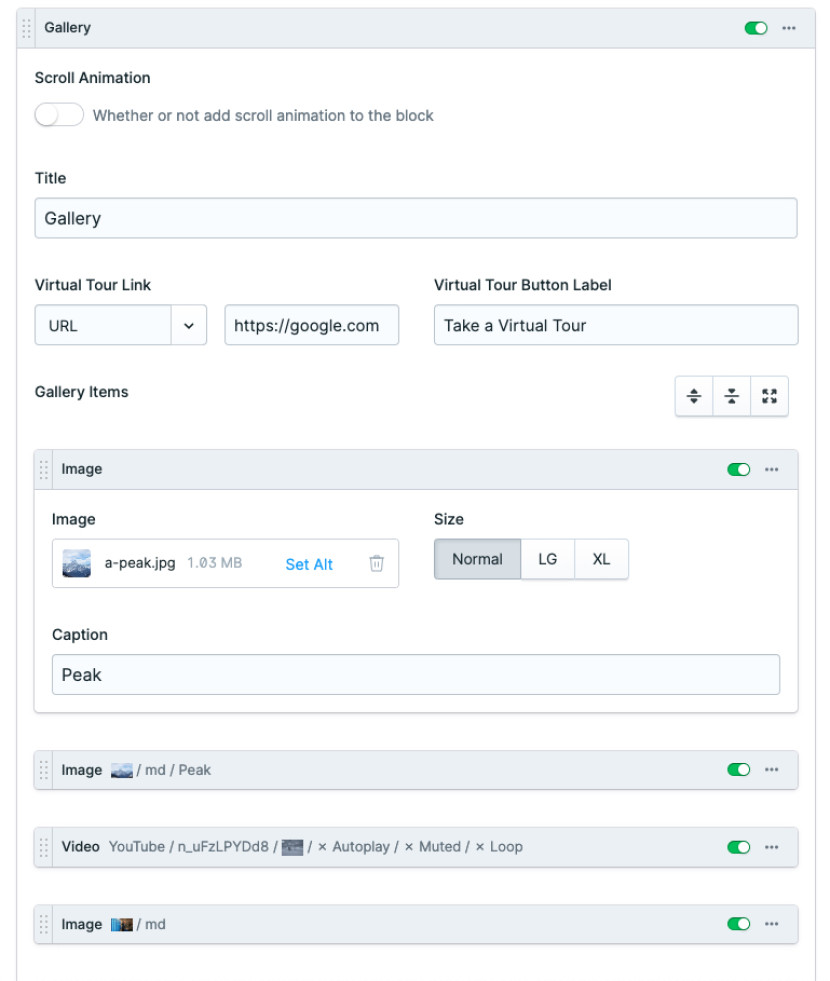
A bit more background information: ‘Gallery Items’ replicator field contains two sets to choose from - Image or a Video. There is no limit on the number of sets, and the order of items is also fully configurable.
Images can be added via the Assets field. Video set has an option to embed videos from Vimeo or YouTube platforms.
The slider in a mobile layout pulls content from the Gallery Items replicator fieldset using a regular statamic syntax.
{{ gallery_items }}
	...
{{ /gallery_items }}
For the slider in a desktop layout to work and look like in the design, we had to split the gallery_items into arrays containing 2 items each, and store it as a variable to use throughout the block, so we couldn’t use the Statamic’s chunk modifier.
{{ galleryCount = gallery_items | count }}
{{ numberOfArrays = galleryCount | divide(2) }}
{{ galleryArrays = gallery_items | split_array:{{ numberOfArrays }} }}
*The naming convention is different on purpose. I’m keeping custom made variables as camelCase, to differentiate them from the statamic variables.
Having an array of arrays (the arrayception), we can now pull this data into a splide.js slider, where each array of two items will be one slide. The syntax will be the same as in the mobile layout, but looping through the galleryArrays instead of gallery_items.
But that’s not the end. As each slide contains two items, we will use an index to pull correct assets. Therefore inside the main loop, we will create another one:
{{ galleryArrays }}
	<li>
		{{ galleryArrays[index] }}
			...
		{{ /galleryArrays[index] }}
	</li>
{{ /galleryArrays }}
Inside that inner loop, we can add markup to display an image or a video.
The modal
To track which item’s modal is open, x-data has been added to the root <section> tag of the gallery block.
<section x-data="{showModal: null, showModalDesktop: ''}">
...
</section>
Once again, the modal on the mobile layout was straightforward, and the desktop layout one quite challenging. Initially there was only one variable to use for both layouts, although as the way of pulling data into both sliders is so different, they had to be separated.
Mobile layout modal, when open, will change the variable to the index of the asset. However, as the index of the desktop assets would be either zero or one (remember our array of arrays? Each array contains only two items!), showModalDesktop will change into an ID of the item instead. We will use this to output the correct image in the modal and find the previous/next images for the arrow buttons.
The modal’s themselves are placed inside the inner loop (to access the correct data). However, to display properly on screens, we use alpine.js x-teleport directive to transport this part into another part of the DOM (direct child of the body tag in this case).
X-show with an x-cloak directive is responsible for showing and hiding the modals,
#_gallery.antlers.html

<template x-teleport="#alpineTeleport">
	<div x-show="showModalDesktop === '{{ id }}'" x-cloak>
		...
	</div>
</template>


#layout.antlers.html

...
<body>
	...
	<div id="alpineTeleport"></div>
	...
</body>
Again, the modal for a mobile layout was effortless, using asset’s index to open the modal, display the correct image, and add functionality to the previous/next arrows (index -1 and index+1).
The modal for a desktop layout needed a bit more data digging. As already mentioned, the ID of the item is stored in an x-data directive. We will use it to loop through the array of ALL items (the one that mobile layout is using) to find their index. Just like the ID of the previous and next indexes, this will be used for the arrow buttons.
{{ currentId = id }}
{{ currentIndex = 0 }}
{{ previousIndex = 0 }}
{{ nextIndex = 0 }}
{{ previousId = '' }}
{{ nextId = '' }}

{{ gallery_items }}
{{ if id == currentId }}
{{ currentIndex = index }}
{{ /if }}
{{ /gallery_items }}

{{ previousIndex = currentIndex - 1 }}
{{ nextIndex = currentIndex + 1 }}

{{ gallery_items }}
{{ if index == previousIndex }}
{{ previousId = id }}
{{ /if }}

{{ if index == nextIndex }}
{{ nextId = id }}
{{ /if }}
{{ /gallery_items }}
Conclusion
This gallery slider has been fun yet challenging to develop. Leveraging open source tools yet still creating something custom and one of a kind.
More Articles

Why Statamic for Membership Platform
Why Statamic works brilliantly as a membership platform for large organisations. Flexible, secure, and built on Laravel.

Laravel for Agentic Development
If you're a founder, CTO, or product manager with a Laravel-powered platform, understanding what these are and what they make possible puts you in a much stronger position to make good decisions.

Eloquent explained: what it is and why it matters
Eloquent in plain English. What Laravel's ORM actually does, why your developers love it, and the questions to ask in your next project meeting.
