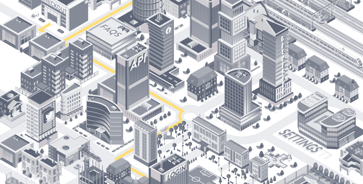
Your web applications should be designed like cities.
Recently, Steadfast Collective’s Managing Director Pete went to watch his first away game supporting the Saints, after which, he learnt a valuable lesson about user experience and how we apply it to the building of our web applications and digital products:
I’ve been working on web applications for many years now; projects ranging from niche internal digital products to global digital applications with over 11-million users.
A few weeks ago, I had a real-life UX problem while in Manchester, which led me to think further about how we all should be building our applications.
It was a grey day in Manchester and we had just watched Southampton FC lose 3-2 to Manchester United at Old Trafford.
When we left the stadium, we headed towards the nearest tram station, where we were greeted by two queues signposted ‘Need tickets’ and ‘Have tickets’.
This felt very efficient and I was somewhat impressed. We stepped into the ‘Need tickets’ queue and waited patiently, noticing a few people turning back, wading through the sea of red football jerseys.
Once we eventually reached the front of the queue, we found out why: ‘Tram tickets £4. Cash only.’

We were in England’s third biggest city, visiting the tram station closest to their biggest public venue, only to queue and find out that it is cash only. Not only that, but you have to wait around a considerable length of time, only to reach the front of the queue and find out that your bank card isn’t going to cut it here.
For all the locals, this wasn’t a problem. They’re used to it; a quirk that they’ve likely come across many times and prepare for ahead of time. As a tourist, this was something I was not expecting. If we were in the digital world, Google Analytics would have recorded this conversion as failed.
Web applications should be designed like cities that receive a lot of tourists.
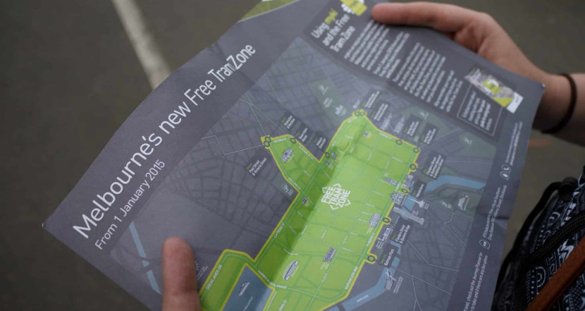
All cities have their quirks: Melbourne has a free tram system. In New York, the ferries are incredibly cheap. In London, you can use your contactless card as a ticket for the underground.(As a side note, the free tram system around Melbourne makes me want to visit again. Free transport around a city you don’t know decreases stress for tourists five-fold.)
Our web applications reflect the individuality of a city’s ecosystem and we need to get better at accommodating our offering for tourists.
Let me give you an example of a real-life web application quirk:
Buffer, the $60M social media management company has a quirk which we have been dealing with for years at Steadfast Collective. LinkedIn has a limited authorisation period; it’s 60 days. So every 60 days, we have to re-connect our LinkedIn account to Buffer.
To do so, however, I have to head to LinkedIn and remove Buffer from the ‘partners and services’ settings and then head back to Buffer to reconnect. It feels crazy. You can read more about this process here.
When we developed a new web application, Social Handler – the social management application for franchises, we hit the same problem.
We built this application, in Laravel and Vue.js to seamlessly connect to Facebook, Twitter and LinkedIn, acting as a social distribution platform for Franchises and Franchisees. We worked with the API to create a button, which after 60 days seamlessly enables the user to re-connect to LinkedIn right within the app, thus avoiding how-to guides and complex processes.
When we think of the users of our applications like tourists, then we can start making design decisions that make the user experience that bit better for everyone; old or new.
So practically, how can we, as designers and developers, learn to do this better?
Talk to users. What is their biggest pain-point? How can we solve this easily and efficiently?
Have a ‘tourist-first’ approach to design. Design and build in a way which informs and guides someone through your web application. Don’t let them fill in a huge form, only for them to find out that it’s ‘cash only’ (or more likely Paypal) at the end.
Stop. Review. Go. When you’re working away on a long-term project, which is in its 12th phase, often you need to stop, review the situation and then go.
It’s amazing the scale of impact one minor hurdle can have on whether a user sticks with your application or leaves to go elsewhere. Guide them through your city, showing them the best spots along the way and they are far more likely to return time and time again.
If there’s one thing I’ve learnt from my experience in Manchester, it is to start simple, considering everything from an outsider’s perspective, then building your infrastructure around user-flow.
More Articles

Laravel Cloud: What It Means for Your Business
Laravel Cloud is here. Learn what it means for your business, how migration works, and why it matters for custom software teams.
Search and filtering at scale in Laravel
Why your Laravel search is a critical part of the member experience
Laracon EU 2026 Recap: AI, Mobile Apps, and What It Means for Your Business
Over a thousand developers gathered at the Passenger Terminal in Amsterdam for Laracon EU 2026. Two days of talks. Two days of demos. And a clear signal about where Laravel is heading.

